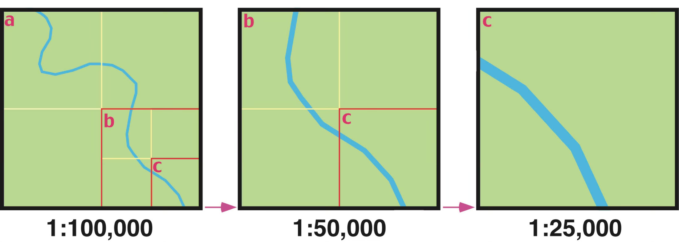
FIGURE 2.4 The following three illustrations describe the relationship between map scale and the size of the ground area shown at three different map scales. The map on the far left has the smallest scale, while the map on the far right has the largest scale. Note what happens to the amount of area represented on the maps when the scale is changed. Doubling the scale (1:100,000 to 1:50,000, then 1:50,000 to 1:25,000) reduces the area shown on the map by 25% or one-quarter. Image Copyright: Michael Pidwirny.
Maps as Models of Reality
A map can be simply defined as a graphic representation of the real world. This graphic representation is always an abstraction or generalization of reality because it is impossible to capture all the complexity found around us. Topographic maps are designed to abstract the three-dimensional real world on a two-dimensional plane of paper. This abstraction removes much of the detail found in the area depicted. For example, vegetated areas on a topographic map are often colored green to indicate the general presence of plants. Yet in the real world, we know that these areas are populated by a variety of plant sizes and species.
Maps are used to display both cultural and physical features of the environment. Standard topographic maps show a variety of information, including roads, land-use classification, elevation, rivers and other water bodies, political boundaries, and the identification of houses and other types of buildings. Some maps are created with very specific goals in mind. Figure 2.1 displays a weather map showing the locations of low and high pressure centers and fronts across most of North America. The intended purpose of this map is considerably more specialized than a topographic map.
The construction and use of maps has a long history. Some academics believe that the earliest maps date back to the fifth or sixth century BCE. Even in these early maps, the main goal of this tool was to communicate information. Early maps were quite subjective in their presentation of spatial information. Maps became more objective and accurate with the use of mathematics and science in cartography. Today, the art of map-making is a sophisticated science that employs methods from cartography, engineering, computer science, mathematics, and psychology.
Cartographers, the individuals who construct maps, classify maps into two broad categories: reference maps and thematic maps. Reference maps typically show natural and human-made features of the environment, emphasizing location. Examples of general reference maps include maps found in atlases and topographic maps. Thematic maps display the geographical distribution of a single phenomenon or the spatial associations among different phenomena (Figure 2.2).
Map Scale
Maps are rarely drawn at the same scale as the real world. Most maps are made at a much smaller scale than the area of the surface they depict. The amount of reduction that has occurred is typically indicated on the map. This measurement is commonly called the map scale. Conceptually, we can think of map scale as the ratio of the distance between any two points on the map compared to the actual ground distance. This idea can also be expressed mathematically as:
Most maps represent the map scale by a simple fraction or ratio. This type of description of a map's scale is called a representative fraction. For example, a map where one unit (centimeter, meter, inch, kilometer, etc.) on the illustration represents 1,000,000 of these same units on the actual surface of the Earth would have a representative fraction of 1/1,000,000 (fraction) or 1:1,000,000 (ratio). Of these mathematical representations of scale, the ratio form is most commonly found on maps. Most maps also use a graphic scale to portray the distance relationships between the map and the real world. On agraphic scale, an illustration depicts distances on the map in standard units of measurement (Figure 2.3). Graphic scales are pretty helpful because they let you measure distances on a map quickly. Scale can also be represented on a map by a verbal statement. For example, 1:1,000,000 could be orally described as 1 centimeter on the map equals 10 kilometers on the Earth's surface, or 1 inch represents approximately 16 miles.
In relative terms, maps are often described as either small-scale or large-scale. Figure 2.4 helps to explain this idea. This figure has three maps representing an area of the world at scales of 1:100,000, 1:50,000, and 1:25,000. Of this group, the map at 1:100,000 has the smallest scale. The map with the largest scale is Map C, which is drawn at a scale of 1:25,000.


FIGURE 2.2 Thematic map showing surface soil moisture conditions across the United States for April 20, 2026. From this map, we can identify areas experiencing drought in the central USA. Image Source: NASA Grace.
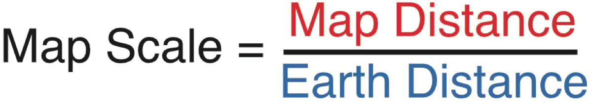

FIGURE 2.3 The following graphic scale was drawn for a map with a scale of 1:25,000 (4 cms = 1 kilometer). In the illustration, distances in miles and kilometers are graphically shown. Image Copyright: Michael Pidwirny.
FIGURE 2.1 National Oceanic and Atmospheric Administration (NOAA) weather map. The following specialized weather map displays location of precipitation, the pressure centers, and fronts for Thursday, April 22, 2026 over a portion of North America. Image Source: NOAA - National Weather Service.